Foodies
Foodies
September, 2025
Foodies turns everyday dining into a rewarding experience, bridging real-world restaurants with Web3 technology for a new generation of food enthusiasts. It transforms complex on-chain mechanics into familiar, intuitive interactions, making earning crypto feel as natural as ordering your favorite meal.
Foodies turns everyday dining into a rewarding experience, bridging real-world restaurants with Web3 technology for a new generation of food enthusiasts. It transforms complex on-chain mechanics into familiar, intuitive interactions, making earning crypto feel as natural as ordering your favorite meal.
Foodies turns everyday dining into a rewarding experience, bridging real-world restaurants with Web3 technology for a new generation of food enthusiasts. It transforms complex on-chain mechanics into familiar, intuitive interactions, making earning crypto feel as natural as ordering your favorite meal.
Foodies turns everyday dining into a rewarding experience, bridging real-world restaurants with Web3 technology for a new generation of food enthusiasts. It transforms complex on-chain mechanics into familiar, intuitive interactions, making earning crypto feel as natural as ordering your favorite meal.
Role
Senior Product Designer
Project Type
Web3 Eat-to-Earn Mobile App
& Gamified Dining Platform
Team
10 members (Sole Designer)
My Contribution
UX Audit, Information Architecture, End-to-End Redesign, User Flow Architecture, Design System, Onboarding Flow Design, Reward Mechanics UX, Component-Driven Design
UX Audit, Information Architecture,
End-to-End Redesign, User Flow Architecture, Design System, Onboarding Flow Design, Reward Mechanics UX, Component-Driven Design
Role
Senior Product Designer
Project Type
Web3 Eat-to-Earn Mobile App
& Gamified Dining Platform
Team
10 members (Sole Designer)
My Contribution
UX Audit, Information Architecture, End-to-End Redesign, User Flow Architecture, Design System, Onboarding Flow Design, Reward Mechanics UX, Component-Driven Design

Challenge
Challenge
Foodies (ex Plato) set out to build a product at the intersection of two worlds that rarely coexist gracefully: the social energy of food culture and the technical depth of Web3. The original interface exposed too much of its blockchain architecture too early, creating friction at the exact moment users needed to feel the value of dining rewards. The design leaned heavily on crypto conventions, with aggressive visual language, front-loaded wallet setup, and multi-token complexity leaving the majority of users confused before they ever earned their first reward. The core challenge was making a decentralized product feel like a lifestyle app, without compromising the depth that crypto-native users expect.
Foodies (ex Plato) set out to build a product at the intersection of two worlds that rarely coexist gracefully: the social energy of food culture and the technical depth of Web3. The original interface exposed too much of its blockchain architecture too early, creating friction at the exact moment users needed to feel the value of dining rewards. The design leaned heavily on crypto conventions, with aggressive visual language, front-loaded wallet setup, and multi-token complexity leaving the majority of users confused before they ever earned their first reward. The core challenge was making a decentralized product feel like a lifestyle app, without compromising the depth that crypto-native users expect.
Foodies (ex Plato) set out to build a product at the intersection of two worlds that rarely coexist gracefully: the social energy of food culture and the technical depth of Web3. The original interface exposed too much of its blockchain architecture too early, creating friction at the exact moment users needed to feel the value of dining rewards. The design leaned heavily on crypto conventions, with aggressive visual language, front-loaded wallet setup, and multi-token complexity leaving the majority of users confused before they ever earned their first reward. The core challenge was making a decentralized product feel like a lifestyle app, without compromising the depth that crypto-native users expect.
Solution
Solution
The redesign was built on a single principle: earn first, learn later. By restructuring the information architecture around three emotional states, discovering a place, dining right now, and claiming a reward, the complexity of the underlying protocol became invisible to those who did not need it and accessible to those who did. A food-forward visual system replaced the fatiguing red interface, 195 screens were rebuilt across six core flows, and a full design system was created from scratch. The result is an experience that serves a casual diner and a DeFi power user within the same product, without either feeling like a compromise.
The redesign was built on a single principle: earn first, learn later. By restructuring the information architecture around three emotional states, discovering a place, dining right now, and claiming a reward, the complexity of the underlying protocol became invisible to those who did not need it and accessible to those who did. A food-forward visual system replaced the fatiguing red interface, 195 screens were rebuilt across six core flows, and a full design system was created from scratch. The result is an experience that serves a casual diner and a DeFi power user within the same product, without either feeling like a compromise.
The redesign was built on a single principle: earn first, learn later. By restructuring the information architecture around three emotional states, discovering a place, dining right now, and claiming a reward, the complexity of the underlying protocol became invisible to those who did not need it and accessible to those who did. A food-forward visual system replaced the fatiguing red interface, 195 screens were rebuilt across six core flows, and a full design system was created from scratch. The result is an experience that serves a casual diner and a DeFi power user within the same product, without either feeling like a compromise.
195
195
195
195
Screens designed
across 6 core flows
Screens designed
across 6 core flows
Screens designed
across 6 core flows
80+
80+
80+
80+
Components built
Components built
Components built
5 wks
5 wks
5 wks
5 wks
Sprint duration
Sprint duration
Sprint duration


Design Sprint
Design Sprint
A structured 5-week sprint from audit to prototype, with each week assigned a clear focus and deliverable. No overlapping phases, no guesswork, just a disciplined process that kept 195 screens on track.
A structured 5-week sprint from audit to prototype, with each week assigned a clear focus and deliverable. No overlapping phases, no guesswork, just a disciplined process that kept 195 screens on track.
A structured 5-week sprint from audit to prototype, with each week assigned a clear focus and deliverable. No overlapping phases, no guesswork, just a disciplined process that kept 195 screens on track.

UX Audit
UX Audit
Before touching Figma, every major pain point in the original app was documented and scored. Five critical issues across visual design, onboarding, trust and core flows, each one mapped to a specific redesign decision.
Before touching Figma, every major pain point in the original app was documented and scored. Five critical issues across visual design, onboarding, trust and core flows, each one mapped to a specific redesign decision.
Before touching Figma, every major pain point in the original app was documented and scored. Five critical issues across visual design, onboarding, trust and core flows, each one mapped to a specific redesign decision.

User Research
User Research
Three personas built from real product behavior, not assumptions. Each one carries a distinct goal, a frustration from the original app, and a direct solution from the redesign, making the research actionable rather than decorative.
Three personas built from real product behavior, not assumptions. Each one carries a distinct goal, a frustration from the original app, and a direct solution from the redesign, making the research actionable rather than decorative.
Three personas built from real product behavior, not assumptions. Each one carries a distinct goal, a frustration from the original app, and a direct solution from the redesign, making the research actionable rather than decorative.

Login. The First Impression
That Sets the Tone
Login. The First Impression
That Sets the Tone
The login screen is the first thing a user sees, and it needed to earn their attention immediately. The ideal approach would have been to defer sign-up until after the user had already experienced the product, but technical constraints made that impossible. Instead, the existing flow was rebuilt from the ground up. A carousel was introduced on the first screen to surface app updates and key features, giving users meaningful context before they ever tap a button. The number of steps required to complete sign-up was reduced to an absolute minimum, turning a forgettable gateway into a proper first touchpoint.
The login screen is the first thing a user sees, and it needed to earn their attention immediately. The ideal approach would have been to defer sign-up until after the user had already experienced the product, but technical constraints made that impossible. Instead, the existing flow was rebuilt from the ground up. A carousel was introduced on the first screen to surface app updates and key features, giving users meaningful context before they ever tap a button. The number of steps required to complete sign-up was reduced to an absolute minimum, turning a forgettable gateway into a proper first touchpoint.
The login screen is the first thing a user sees, and it needed to earn their attention immediately. The ideal approach would have been to defer sign-up until after the user had already experienced the product, but technical constraints made that impossible. Instead, the existing flow was rebuilt from the ground up. A carousel was introduced on the first screen to surface app updates and key features, giving users meaningful context before they ever tap a button. The number of steps required to complete sign-up was reduced to an absolute minimum, turning a forgettable gateway into a proper first touchpoint.

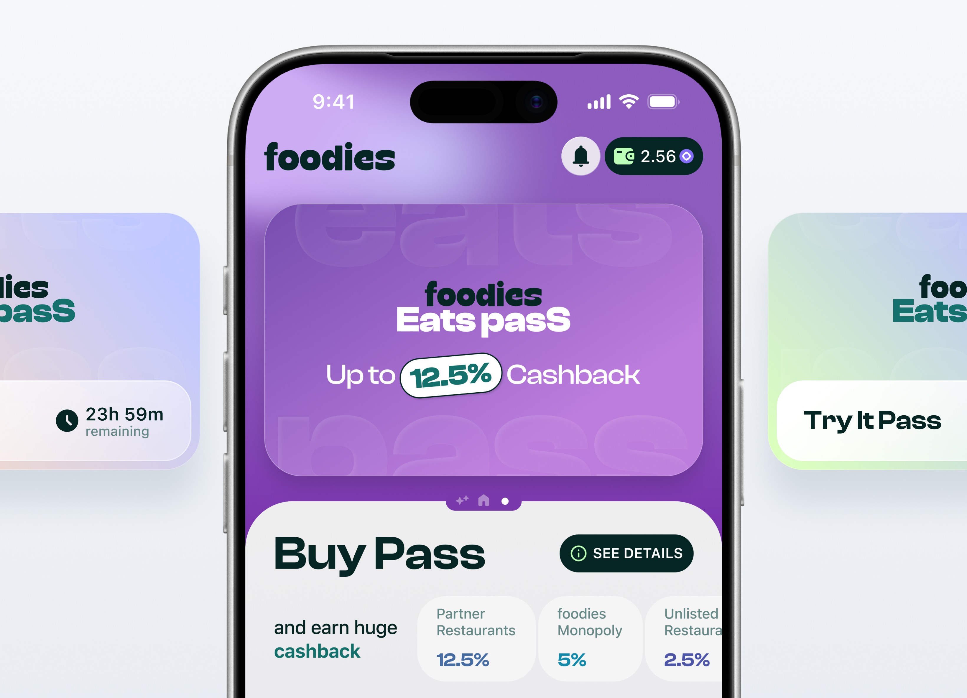
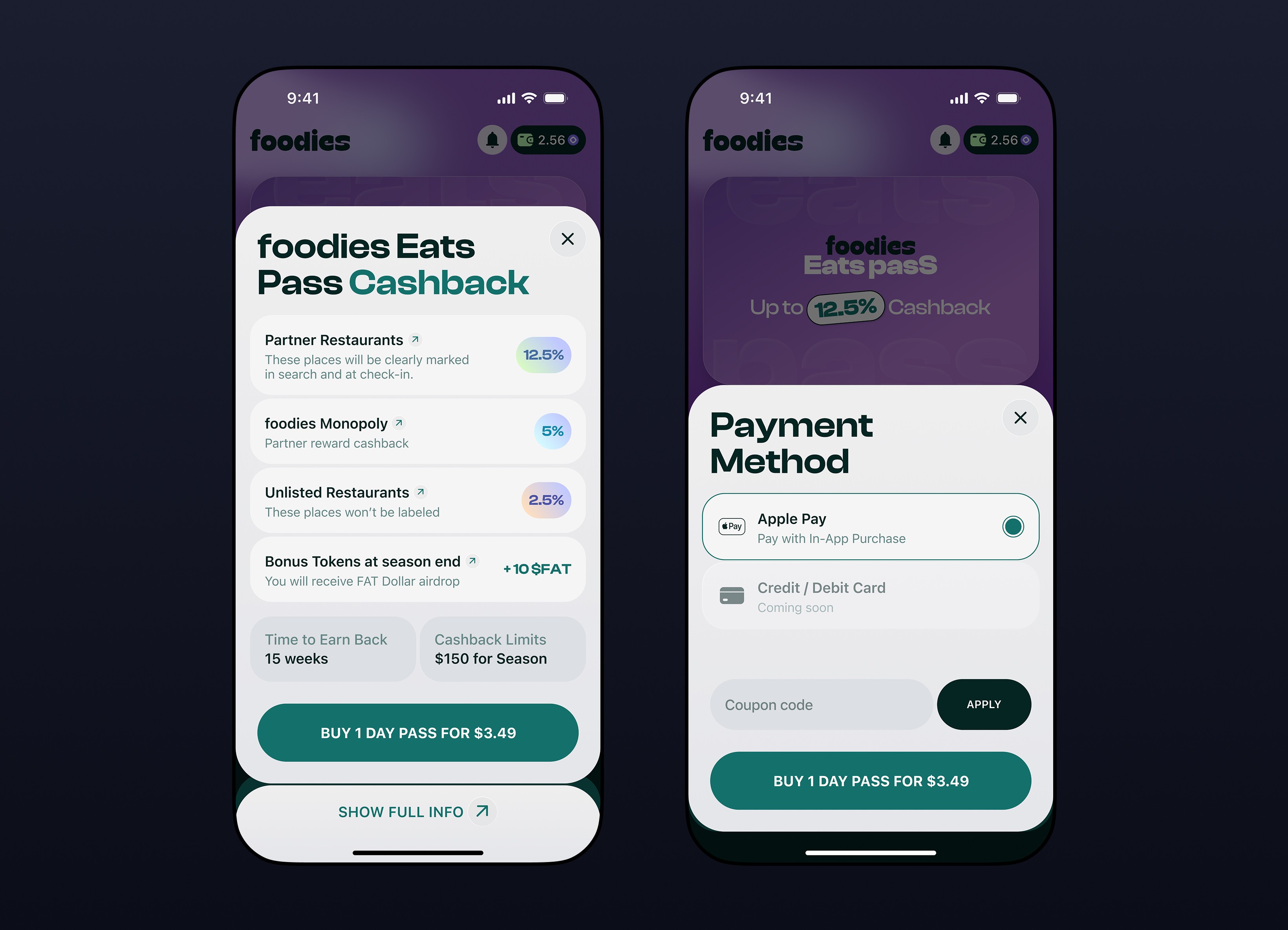
Eats Pass. The Core of the Business Model
Eats Pass. The Core
of the Business Model
Eats Pass. The Core of the Business Model
Eats Pass is where the app makes its value proposition concrete, and it had to be impossible to misunderstand. The screen is now accessible with a single left swipe from the home screen. Multiple visual themes were designed to shift with the user's subscription tier, making status feel personal and earned. The subscription flow itself was completely rebuilt. Every benefit is now visible upfront without needing to dig into submenus, and selecting a plan takes a single tap. After subscribing, users land on an Overview screen that maps all available cashback categories and bonuses in one place, with clean navigation between them. Transparent, frictionless and immediately rewarding.
Eats Pass is where the app makes its value proposition concrete, and it had to be impossible to misunderstand. The screen is now accessible with a single left swipe from the home screen. Multiple visual themes were designed to shift with the user's subscription tier, making status feel personal and earned. The subscription flow itself was completely rebuilt. Every benefit is now visible upfront without needing to dig into submenus, and selecting a plan takes a single tap. After subscribing, users land on an Overview screen that maps all available cashback categories and bonuses in one place, with clean navigation between them. Transparent, frictionless and immediately rewarding.
Eats Pass is where the app makes its value proposition concrete, and it had to be impossible to misunderstand. The screen is now accessible with a single left swipe from the home screen. Multiple visual themes were designed to shift with the user's subscription tier, making status feel personal and earned. The subscription flow itself was completely rebuilt. Every benefit is now visible upfront without needing to dig into submenus, and selecting a plan takes a single tap. After subscribing, users land on an Overview screen that maps all available cashback categories and bonuses in one place, with clean navigation between them. Transparent, frictionless and immediately rewarding.


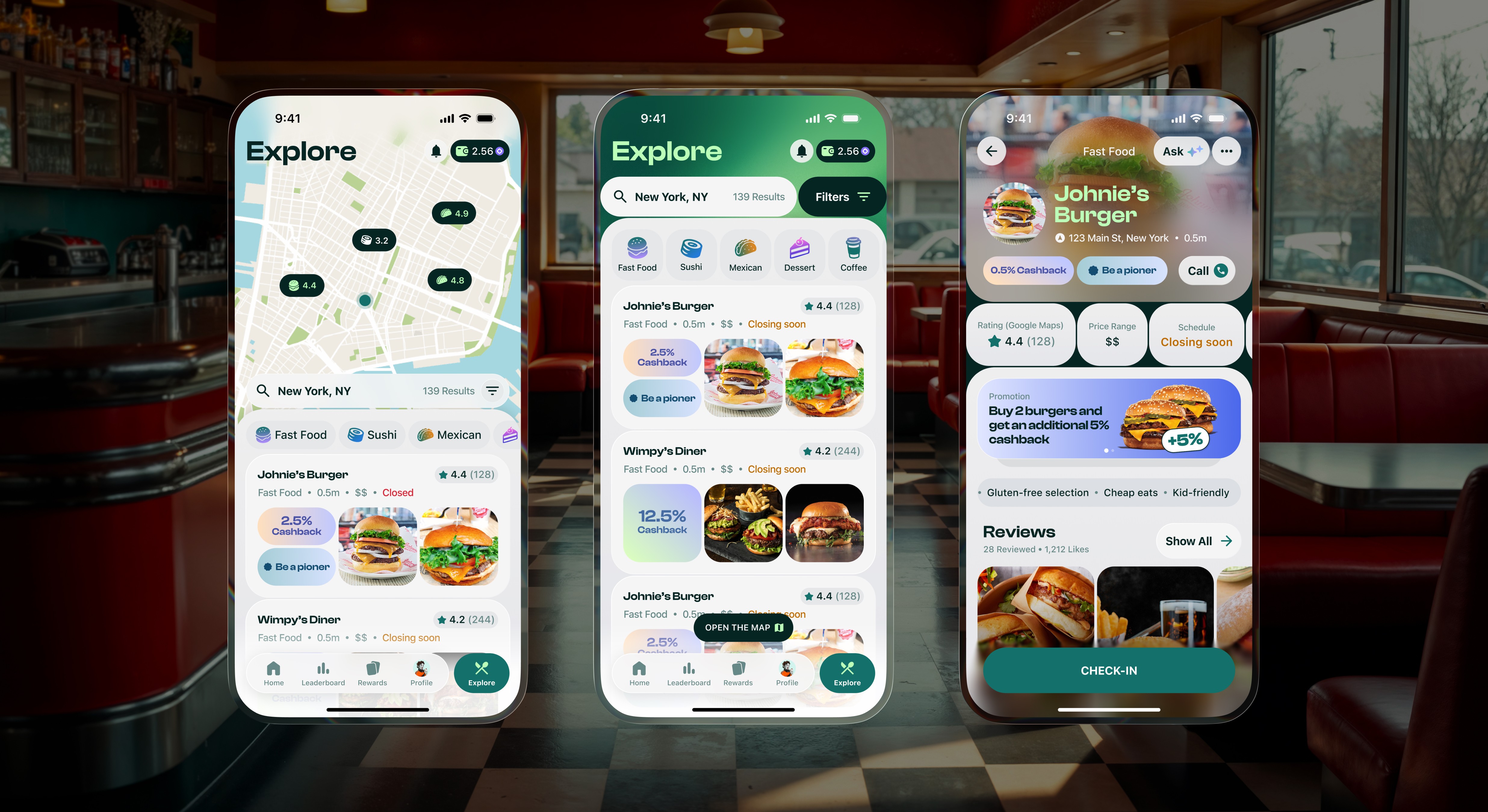
Explore. Find Places Worth Eating At
Explore. Find Places
Worth Eating At
Explore. Find Places Worth Eating At
The map interface received a full visual and structural overhaul. Category icons were redesigned from scratch to align with the new visual language, and the individual venue screen was rebuilt to prioritize the information users actually reach for: cashback percentage, rating, price range, schedule and promotions all visible without scrolling. The goal was to reduce the gap between discovering a place and deciding to go there, and the redesigned page structure does exactly that.
The map interface received a full visual and structural overhaul. Category icons were redesigned from scratch to align with the new visual language, and the individual venue screen was rebuilt to prioritize the information users actually reach for: cashback percentage, rating, price range, schedule and promotions all visible without scrolling. The goal was to reduce the gap between discovering a place and deciding to go there, and the redesigned page structure does exactly that.
The map interface received a full visual and structural overhaul. Category icons were redesigned from scratch to align with the new visual language, and the individual venue screen was rebuilt to prioritize the information users actually reach for: cashback percentage, rating, price range, schedule and promotions all visible without scrolling. The goal was to reduce the gap between discovering a place and deciding to go there, and the redesigned page structure does exactly that.


Ask Foodies. Your AI Dining Assistant
Ask Foodies.
Your AI Dining Assistant
Ask Foodies. Your AI Dining Assistant
"Ask foodies" is a completely new feature with no equivalent in the original app. Accessible from anywhere in the product where discovery matters, it replaces the familiar frustration of scrolling endlessly through Google Maps with a conversational interface that actually knows your context. Users type or tap a prompt, and the AI returns personalized restaurant suggestions with real UGC insights pulled from the platform's own data. It understands questions like "what do locals eat for dinner here" and responds with specific dishes, specific venues and specific reasons to go. Smart discovery, built natively into the dining experience.
"Ask foodies" is a completely new feature with no equivalent in the original app. Accessible from anywhere in the product where discovery matters, it replaces the familiar frustration of scrolling endlessly through Google Maps with a conversational interface that actually knows your context. Users type or tap a prompt, and the AI returns personalized restaurant suggestions with real UGC insights pulled from the platform's own data. It understands questions like "what do locals eat for dinner here" and responds with specific dishes, specific venues and specific reasons to go. Smart discovery, built natively into the dining experience.
"Ask foodies" is a completely new feature with no equivalent in the original app. Accessible from anywhere in the product where discovery matters, it replaces the familiar frustration of scrolling endlessly through Google Maps with a conversational interface that actually knows your context. Users type or tap a prompt, and the AI returns personalized restaurant suggestions with real UGC insights pulled from the platform's own data. It understands questions like "what do locals eat for dinner here" and responds with specific dishes, specific venues and specific reasons to go. Smart discovery, built natively into the dining experience.

Eat2Gether. The Feature That Makes
Foodies Social
Eat2Gether. The Feature
That Makes Foodies Social
Eat2Gether. The Feature
That Makes Foodies Social
Eat2Gether is the app's most distinctive mechanic, letting users dine together at the same venue and earn shared rewards for it. The entire flow was rebuilt to be self-explanatory for every type of user, whether they are crypto-native or opening the app for the first time.
The guiding principle throughout the design process was that every detail matters. To eliminate "empty states" and maintain a rich, polished feel,
a comprehensive system of context-specific placeholders was developed, tailored to both the platform location and the specific sport.
Our approach was defined by engineering micro-interactions and visual elements even in areas where users might not immediately notice them. This commitment to refinement in the smallest details is what differentiates the RBS experience from competitors, ensuring a sense of completeness and premium quality across every touchpoint of the platform.
Eat2Gether is the app's most distinctive mechanic, letting users dine together at the same venue and earn shared rewards for it. The entire flow was rebuilt to be self-explanatory for every type of user, whether they are crypto-native or opening the app for the first time.
Eat2Gether is the app's most distinctive mechanic, letting users dine together at the same venue and earn shared rewards for it. The entire flow was rebuilt to be self-explanatory for every type of user, whether they are crypto-native or opening the app for the first time.
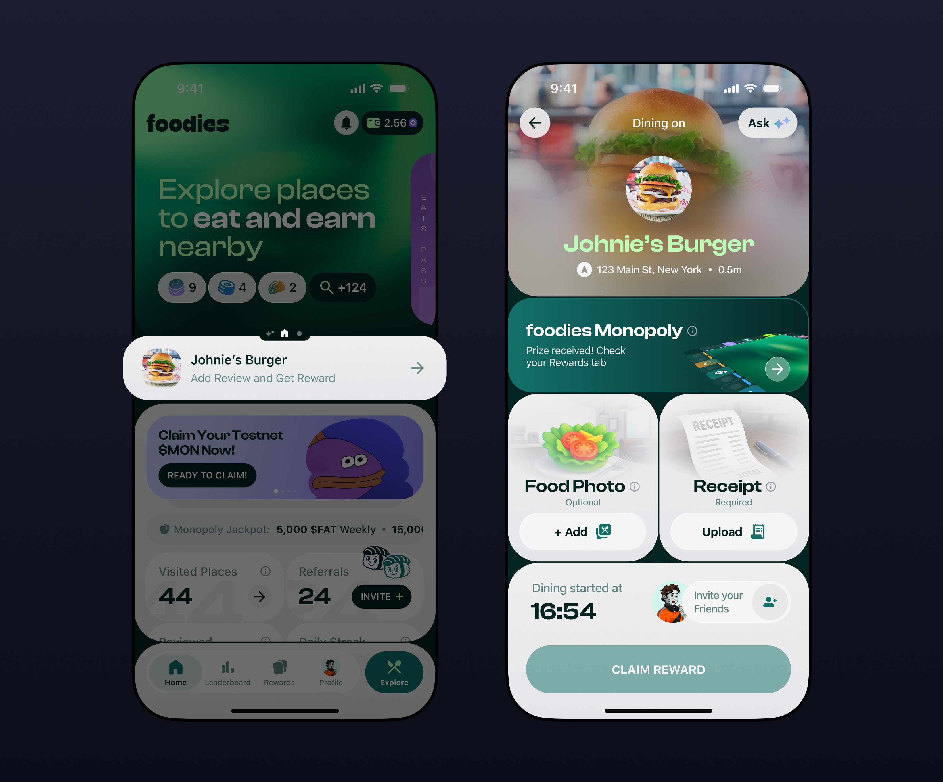


Every action within the flow, photographing a dish, scanning a receipt, confirming a check-in, is presented step by step with clear visual feedback
and highlighted completion states. No user should ever have to wonder what to do next.
A comprehensive set of exclusive league logos and imagery was custom-designed to align with
the RBS visual identity, ensuring a unified and premium aesthetic across the platform.
Every action within the flow, photographing a dish, scanning a receipt, confirming a check-in, is presented step by step with clear visual feedback and highlighted completion states. No user should ever have to wonder what to do next.
Every action within the flow, photographing a dish, scanning a receipt, confirming a check-in, is presented step by step with clear visual feedback and highlighted completion states. No user should ever have to wonder what to do next.


Once the meal ends, the rewards summary screen was redesigned to present the full breakdown in a single transparent view. The Fortune Wheel interface was also updated to match the new visual system, and it remains one of the most anticipated moments in the user journey.
Once the meal ends, the rewards summary screen was redesigned to present the full breakdown in a single transparent view. The Fortune Wheel interface was also updated to match the new visual system, and it remains one of the most anticipated moments in the user journey.

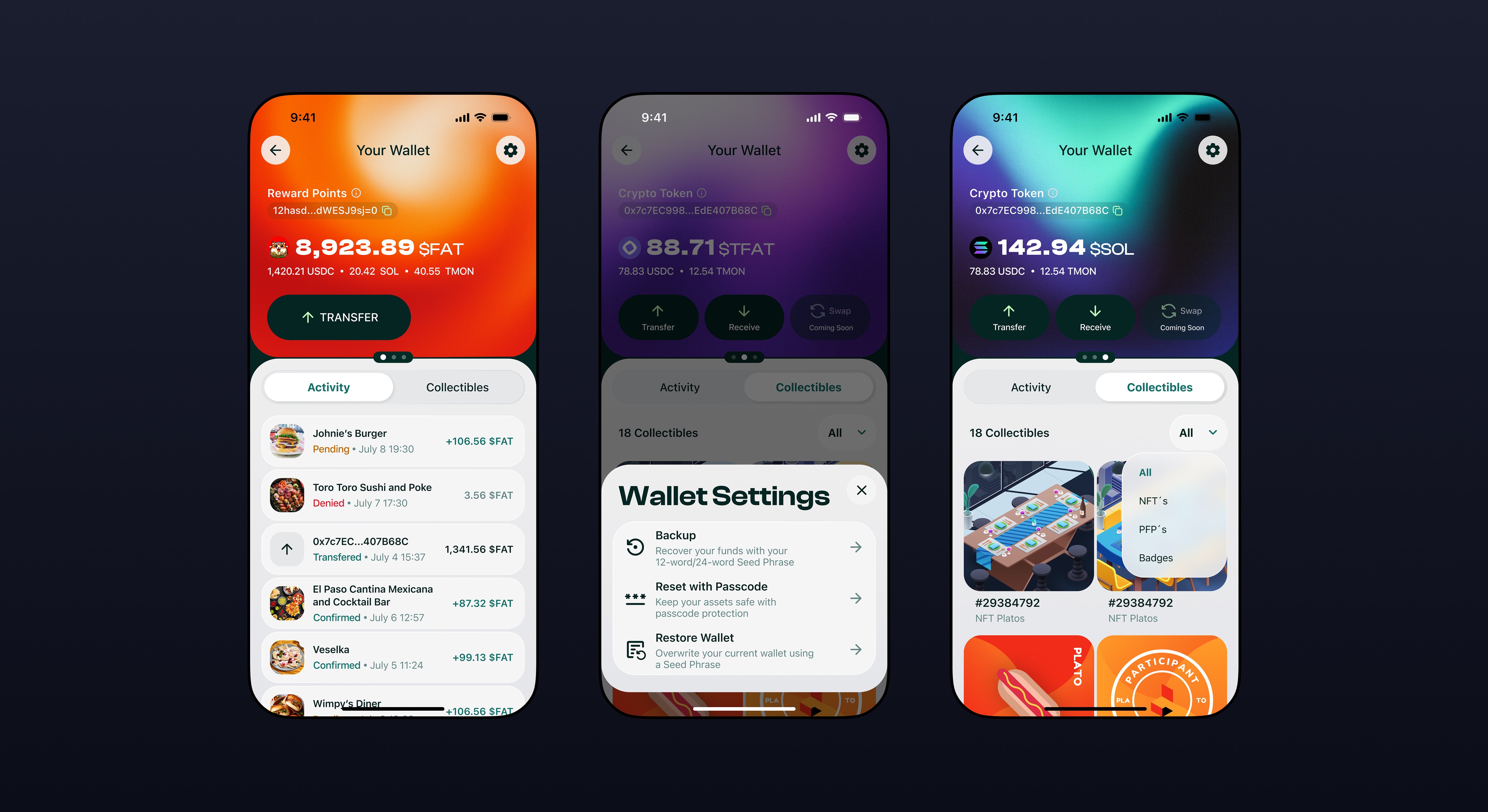
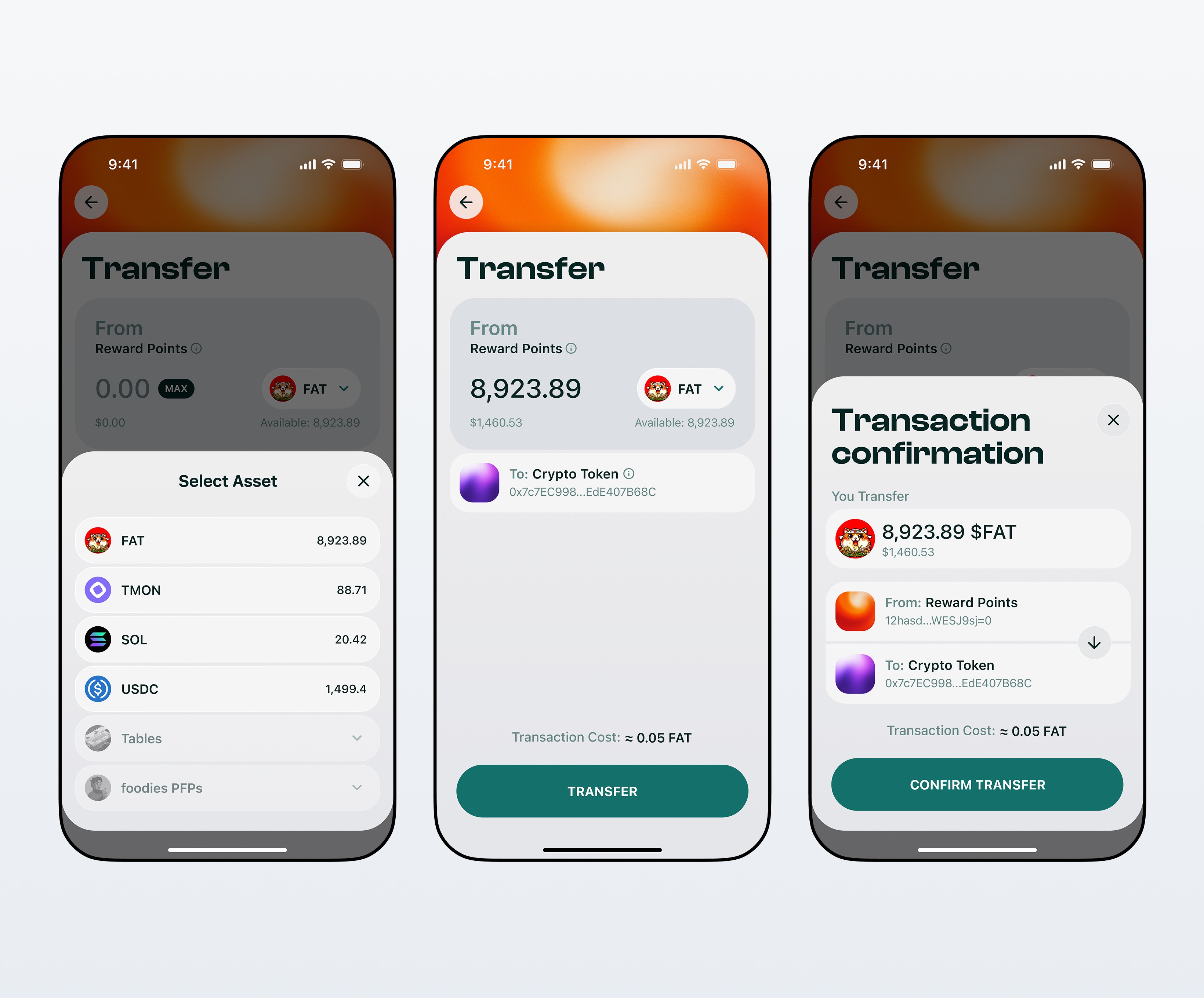
Your Wallet. Your Financial Hub
Your Wallet.
Your Financial Hub
Your Wallet. Your Financial Hub
The wallet screen is where trust either gets built or destroyed. The entire UX was rebuilt around one goal: making users feel safe and in control of their crypto assets. Every action, transferring, receiving, managing collectibles, is presented with clarity and visual polish that signals reliability. Balances are organized by token type with distinct visual treatments, transaction history is clean and status-labeled, and the settings flow covers backup, passcode and wallet restore in plain language. For many users this is their first time holding real on-chain assets. The design treats that responsibility seriously.
The wallet screen is where trust either gets built or destroyed. The entire UX was rebuilt around one goal: making users feel safe and in control of their crypto assets. Every action, transferring, receiving, managing collectibles, is presented with clarity and visual polish that signals reliability. Balances are organized by token type with distinct visual treatments, transaction history is clean and status-labeled, and the settings flow covers backup, passcode and wallet restore in plain language. For many users this is their first time holding real on-chain assets. The design treats that responsibility seriously.
The wallet screen is where trust either gets built or destroyed. The entire UX was rebuilt around one goal: making users feel safe and in control of their crypto assets. Every action, transferring, receiving, managing collectibles, is presented with clarity and visual polish that signals reliability. Balances are organized by token type with distinct visual treatments, transaction history is clean and status-labeled, and the settings flow covers backup, passcode and wallet restore in plain language. For many users this is their first time holding real on-chain assets. The design treats that responsibility seriously.

Check-in. Monopoly, But Make It Dinner
Check-in. Monopoly,
But Make It Dinner
Check-in. Monopoly, But Make It Dinner
Every check-in in foodies feeds into something bigger. Beyond the immediate reward, users collect pieces that contribute to the Monopoly board, a gamification layer built entirely from scratch for this redesign with no equivalent in the original app. The board is organized by category, supports brand and company collaborations, and gives users a persistent reason to keep coming back beyond the meal itself. The response from users was immediate. Monopoly became one of the most talked-about features after launch and brought in an entirely new segment of engaged daily users.
Every check-in in foodies feeds into something bigger. Beyond the immediate reward, users collect pieces that contribute to the Monopoly board, a gamification layer built entirely from scratch for this redesign with no equivalent in the original app. The board is organized by category, supports brand and company collaborations, and gives users a persistent reason to keep coming back beyond the meal itself. The response from users was immediate. Monopoly became one of the most talked-about features after launch and brought in an entirely new segment of engaged daily users.
Every check-in in foodies feeds into something bigger. Beyond the immediate reward, users collect pieces that contribute to the Monopoly board, a gamification layer built entirely from scratch for this redesign with no equivalent in the original app. The board is organized by category, supports brand and company collaborations, and gives users a persistent reason to keep coming back beyond the meal itself. The response from users was immediate. Monopoly became one of the most talked-about features after launch and brought in an entirely new segment of engaged daily users.


Profile. Your Space, Your Story
Profile. Your Space,
Your Story
Profile. Your Space, Your Story
The profile screen is the personal control center of the app. Reviews, achievements, badges, settings and social connections all live here, organized into a clean and scannable layout. Users can customize the experience, track their history and showcase their dining reputation without ever feeling lost in a settings maze.
The profile screen is the personal control center of the app. Reviews, achievements, badges, settings and social connections all live here, organized into a clean and scannable layout. Users can customize the experience, track their history and showcase their dining reputation without ever feeling lost in a settings maze.
The profile screen is the personal control center of the app. Reviews, achievements, badges, settings and social connections all live here, organized into a clean and scannable layout. Users can customize the experience, track their history and showcase their dining reputation without ever feeling lost in a settings maze.

Daily Streak. Keep the Momentum Going
Daily Streak.
Keep the Momentum Going
Daily Streak.
Keep the Momentum Going
Daily Streak. Keep the Momentum Going
Complete daily tasks, advance across a virtual board and unlock new rewards at every level. The streak mechanic is one of the strongest retention tools in the app, giving users a concrete reason to open foodies every single day. Sharing progress is built into the experience, turning personal milestones into social moments and bringing new users in through organic word of mouth.
Complete daily tasks, advance across a virtual board and unlock new rewards at every level. The streak mechanic is one of the strongest retention tools in the app, giving users a concrete reason to open foodies every single day. Sharing progress is built into the experience, turning personal milestones into social moments and bringing new users in through organic word of mouth.
Complete daily tasks, advance across a virtual board and unlock new rewards at every level. The streak mechanic is one of the strongest retention tools in the app, giving users a concrete reason to open foodies every single day. Sharing progress is built into the experience, turning personal milestones into social moments and bringing new users in through organic word of mouth.

Leaderboard. Compete, Climb, Win
Leaderboard. Compete,
Climb, Win
Leaderboard. Compete, Climb, Win
The leaderboard was one of the most visually broken parts of the original app. Top performers looked identical to everyone else, and there was no sense of occasion around winning. The redesign introduces a dedicated podium layout for the top three, segmented categories (Super Connectors, Most $FAT Earned, Top Pioneers) and a persistent personal position anchor so users always know where they stand even if they are ranked 56th. Competition is only motivating when it is legible, and the new leaderboard makes every position feel worth fighting for.
The leaderboard was one of the most visually broken parts of the original app. Top performers looked identical to everyone else, and there was no sense of occasion around winning. The redesign introduces a dedicated podium layout for the top three, segmented categories (Super Connectors, Most $FAT Earned, Top Pioneers) and a persistent personal position anchor so users always know where they stand even if they are ranked 56th. Competition is only motivating when it is legible, and the new leaderboard makes every position feel worth fighting for.
The leaderboard was one of the most visually broken parts of the original app. Top performers looked identical to everyone else, and there was no sense of occasion around winning. The redesign introduces a dedicated podium layout for the top three, segmented categories (Super Connectors, Most $FAT Earned, Top Pioneers) and a persistent personal position anchor so users always know where they stand even if they are ranked 56th. Competition is only motivating when it is legible, and the new leaderboard makes every position feel worth fighting for.

Referral Program. Grow Together,
Earn Together
Referral Program. Grow
Together, Earn Together
The referral program works exactly as users expect from a modern social app, with one important addition: full visibility. Direct and indirect referrals are tracked separately, each invite is timestamped and the total amount earned from referrals is always visible at a glance. Sharing a referral link is a single tap. The screen makes the mechanics of earning through your network completely transparent, which is what was missing in the original.
The referral program works exactly as users expect from a modern social app, with one important addition: full visibility. Direct and indirect referrals are tracked separately, each invite is timestamped and the total amount earned from referrals is always visible at a glance. Sharing a referral link is a single tap. The screen makes the mechanics of earning through your network completely transparent, which is what was missing in the original.
The referral program works exactly as users expect from a modern social app, with one important addition: full visibility. Direct and indirect referrals are tracked separately, each invite is timestamped and the total amount earned from referrals is always visible at a glance. Sharing a referral link is a single tap. The screen makes the mechanics of earning through your network completely transparent, which is what was missing in the original.


